


 인쇄
인쇄


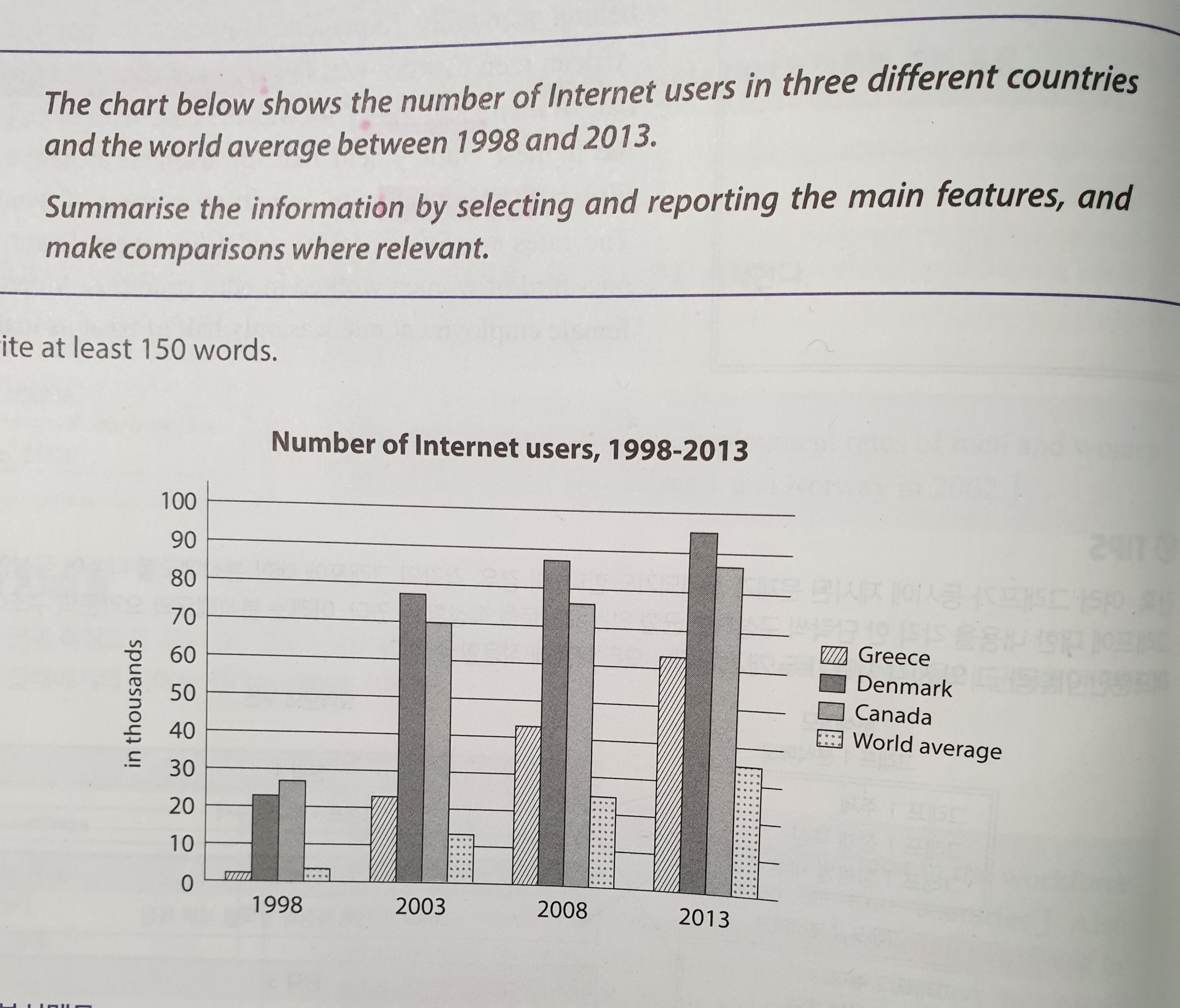
The Chart chart shows the number of Internet users
in Greece, Denmark and Canada and the world average between 1998 and 2013.
The number of Internet Users users has been (표/지도 문제 시제와 관련해서는 누가봐도 현재완료, 미래를 써야되는 경우를 제외하면 모조리 과거로 맞춘다고 생각하시면 됩니다.) increased
in all three countries and the world average of Internet users has been
increased as well. Though, Denmark has had the highest number of Internet users
between 1998 and 2013 among the three countries. (98년의 경우 캐나다 수치가 더 높습니다.) On the contrary, Greece has
shown the lowest number of Internet users Users among them but the users have been
gradually increased. Even though Greece has the lowest among them, the world
average of Internet Users is almost the half of the Greece user number. (언제 그랬는지를 적어주셔야 해요.) Canada
had more Internet Users than Denmark in 1998, but from 2003, it was Denmark that had the most number of users but it had been switched from
2003.
그래프 형식 처음 풀어봤는데, 단어도 너무 반복적으로만 쓰고 어렵네요;;;;;
총평: (5/6/5/5) 5.5
일단 task 1에서는 Overview 를 넣는 것이 중요합니다. 즉, 표가 보여주고 있는 바를 큰 그림에서 요약하는 것이죠. 본격적인 분석에 들어가기에 앞서, 서론 밑에 넣어주시면 되고요. 다른 수험생들의 글을 보면 대략 '아~이런 거구가' 하고 감을 잡으실 수 있을 겁니다.
그리고 원래 task 1이 2보다 훨씬 어렵기 때문에, 혹시 아직 시험을 치르기까지 시간 여유가 조금 있으시면 당분간은 task 1은 손도 대지 않고 task 2에만 집중하는 게 낫습니다. 이와 더불어 어느정도 문법에 대한 기본기를 쌓으시고, 이게 확보된 뒤에 task 1에 착수하면 그래도 조금 더 용이할 거에요.
수고하셨습니다 :)

 비밀번호 확인
 댓글 0개
댓글 0개


 불편사항 신고