


 인쇄
인쇄


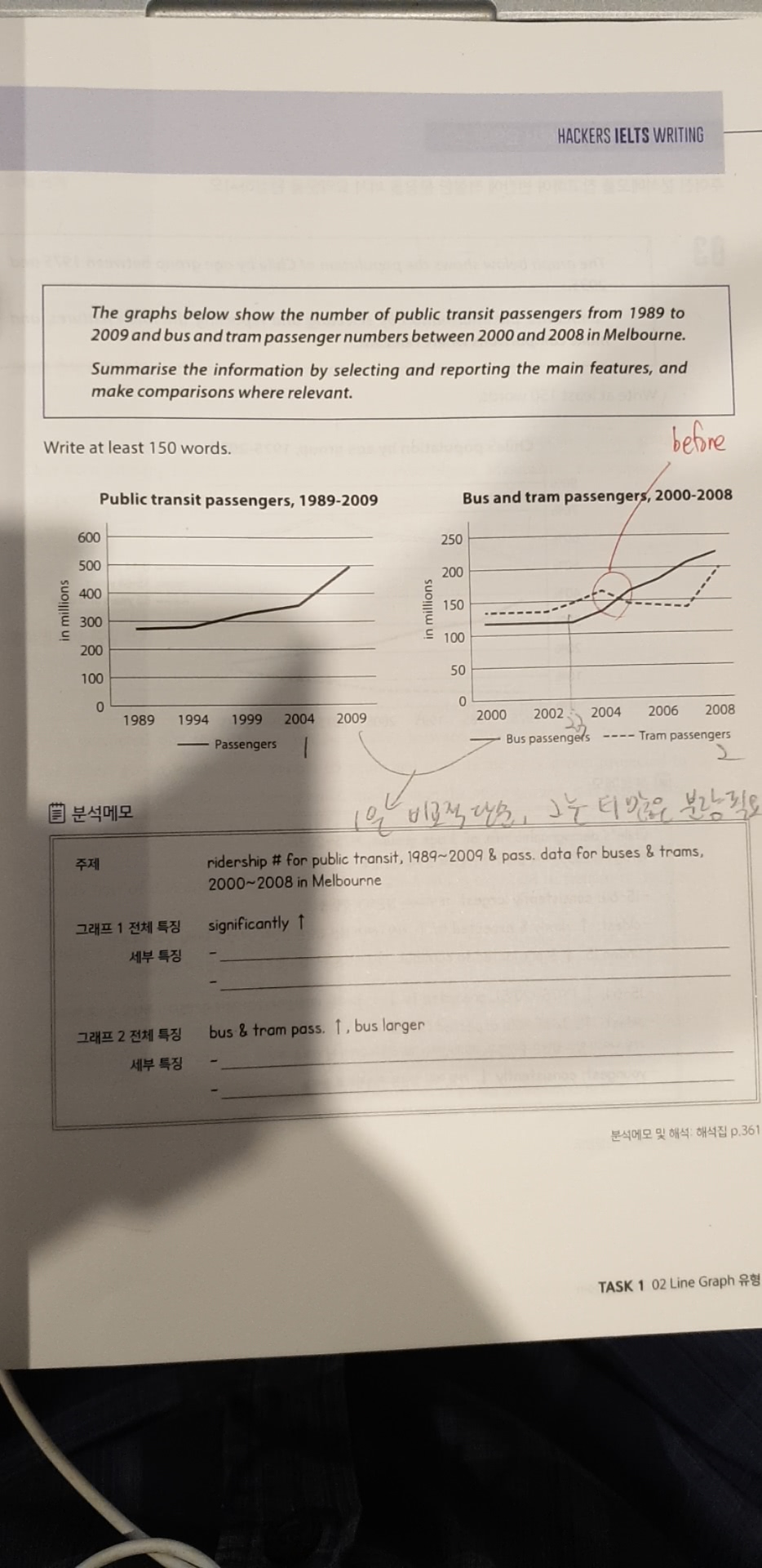
The graphs illustrate the number of public transit passengers from 1989 to 2009 and bus and tram passenger numbers between 2000 and 2008 in Melbourne.
According to the first graph, the number of
passengers using public transportations shows an upward trend throughout the
period in question. During the first 5 years from 1989, the number of passengers
remained almost constant. However, public transportation users grew
significantly from around 250 million in 1994 to 360 million in 2004. In the
last 0five years, the passengers soared sharply, reaching nearly 500 million.
In the second graph, both bus and tram
passengers grew but it is apparent that the former bus users soared more (상대적 대비가 중요하죠.) remarkably. The number
of bus users stayed at around 120 million for the first three years, before it
shot up in 2003. The number of bus passengers (바로 앞에 동일 구조가 있기 때문에 had approximately doubled from
120 million in 2003 to 230 million in 2008. The usage for tram was flat until
2002, at which point it increased for two years before it dipped slightly. Then
from 2007 to 2008, it soared sharply by over 50 million just in one year.
Comparing these two graphs, one can identify that the number of public transportation users in Melbourne had been concentrated on buses and trams, as they account for almost 85 percent of total users.
총평: (7/7/7/6) 7.0
이정도면 충분히 잘 쓰인 글입니다. 아쉬운 점이 있다면 문장 구조들이 너무 숫자 자체에만 이루어져있다는 점이 되겠고요. 굳이 문장을 ~의 수는 ~였다. 라고 표현하지 않더라도, In 연도, 2 people used a tram ~~ 이런 식의 패러프레이징도 가능하므로 잘 활용해주시면 좋을 겁니다. 그리고 지금 마지막 문단의 경우 구조상 어쩔 수 없이 밑으로 가겠지만, 웬만하면 task 1에서의 Overview 는 서론으로 감에 유의해주세요~수고하셨습니다 :)
많이 감사드립니다.

 비밀번호 확인
 댓글 0개
댓글 0개


 불편사항 신고