


 인쇄
인쇄


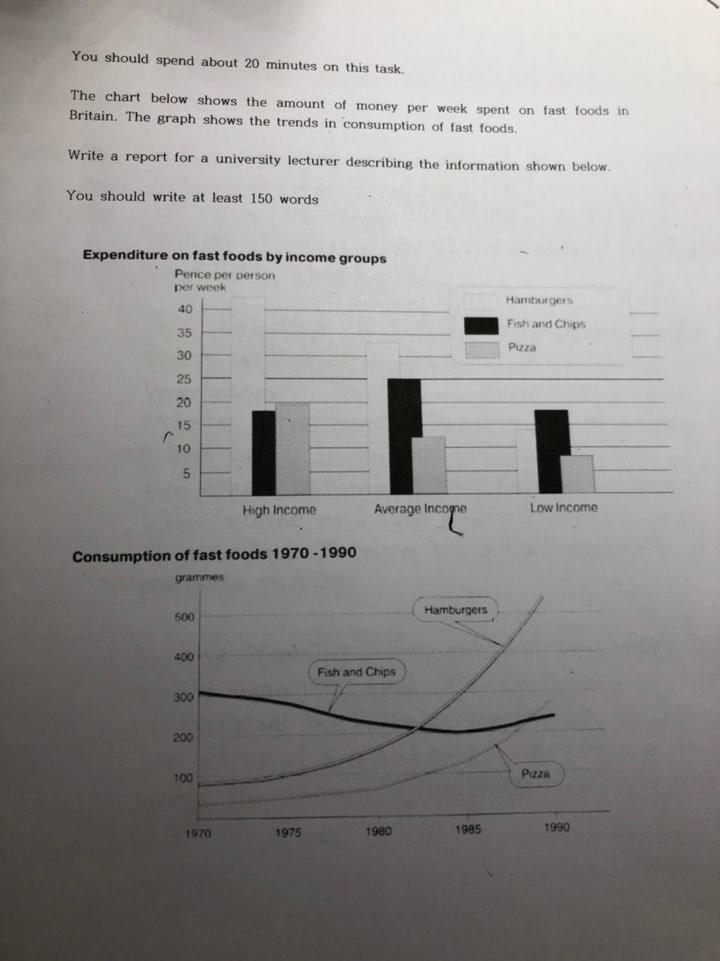
The bar graph compares the volume of money which 3 different categories divided into earning expended to intake fast food every week in the UK. In addition, the line chart indicates the variation in the consumption of hamburgers, fish and chips, and pizza.
It is clear that people who earn higher profit spent the dominant volume of money to eat hamburgers, The lower the given group have estate, the lower the amount of money in pizza was. In the case of fish and chips, the equal volume was expressed between high income and low income groups, but it occupied 25 pence as individual expenditure per week.
Roughly speaking, in the line graph, the consumption of hamburgers surged quickly over 20 years period compared to the original number in 1970. However, the intake of fish and chips went up and down in under 300 grams. Consequently, the figure of pizza overtook the quantity of fish and chips around 1990.

 댓글 0개
댓글 0개


 불편사항 신고