


 인쇄
인쇄


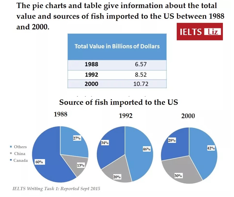
The illustration
and table represent how much the total value of imported fish industry changed during
the period between 1988 and 2000 in the US by dividing three categories. (두 자료는 지금처럼 한 문장에 묶어서 설명할 경우 문장이 꼬이기만 합니다. 굳이 욕심내지 않으셔도 되니까, 두 문장에 걸쳐서 각각에 대한 설명을 해주세요~)
Overall, the rates
of Canadian fishes to the US decreased during the period shown in the pie
charts, while the those of Chinese fishes gradually of soared. As for the total
values of fishing industry, the recent total profits doubled compared to the
past in 1988. (얘가 먼저 언급되어야 합니다.)
In 1988, 60% of imported
fish sources in the US came form from Canada. Meanwhile, a quarter of those was taken by 등 the
rest of nations, excluding China and Canada, however, the proportion of fish from other nationalities suddenly rose
from 27% up to 46% in 1992. In contrast, Canadian fish sources diminished
dramatically by 26% at the same time. Turing into 2000, Chinese fish rates rose
from 13% to 30%. The proportion of China and Canada had balanced rates with 30%
and 42% respectively.
With regard to
the total value in importing fish industry, the figures increased gradually.
Between 1988 and 1992, it rose by nearly 2 billion dollars. Similarly, the
period from 1992 and 2000, approximately 2 billion dollars were gained in this
industry. (이 친구도 마찬가지로, 바로 위의 문단보다 먼저 작성해주셔야 해요.)
총평: (7/6/7/7) 7.0
엄밀히 따지면 두 번째 자료의 overview 는 '기존에 캐나다 쪽에 편중되었던 수치가, 2000년에 들어서는 상대적으로 고른 분포를 보이게 되었다' 와 같이 작성해주셔야 합니다. 6점대에서는 크게 중요하지 않긴 하지만, 그래도 7점 필요하시니까 참고로 말씀드려요! 물론 지금 적어주신 내용도 틀린 건 아니며, 그 외의 세부적인 분석은 잘 되었고, 패러프레이징도 깔끔하게 되었습니다. 대신 이전 글에서도 그랬듯이 서론 구성에 애를 먹고 계신데, 가장 덜 중요한 문단이니까 그냥 빠르고 간결하게 적고 넘어가주세요~이쪽에서의 페러프레이징은 과하게 집착하실 필요 없습니다. 수고하셨습니다 :)
192자

 비밀번호 확인
 댓글 0개
댓글 0개


 불편사항 신고