


 인쇄
인쇄


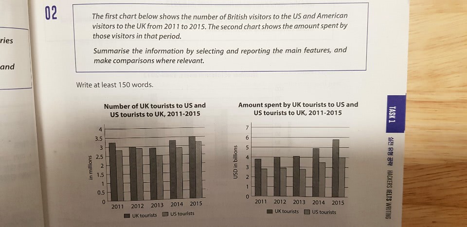
The first bar graph shows the number of British visitors to the US and American tourists to the UK between 2011 and 2015, and the second one indicates how much they spent in that period.
According to the first graph, it is clear that UK tourists to the US were consistently more than US tourists to the UK between 2011 and 2015. The number of UK visitors had decreased slightly until 2013 and then it surged, reaching around 3.5 million by 2015. Meanwhile, US visitors were roughly 0.4 million fewer than UK visitors but the number of US tourists was close to the number of UK visitors in 2012. However, the gap between the both figures had widened again after 2013.
In the second graph, it is apparent that the amounts spent by UK tourists to the US and US tourists to the UK had been consistent for the first three years and they both went up considerably. UK visitors to the US spent about $4 million every year until 2013 but the amount soared rapidly, reaching the highest point of $5.8 million in 2015. The trend of the amount spent by US visitors to the UK was similar to the UK's figures but the gap between them had got larger from roughly $1 million to around $1.8 million from 2011 to the end of the period.

 댓글 0개
댓글 0개


 불편사항 신고