


 인쇄
인쇄


The bar graph below shows the percentage of people that said they regularly enjoyed certain sports from 1985 to 2005.
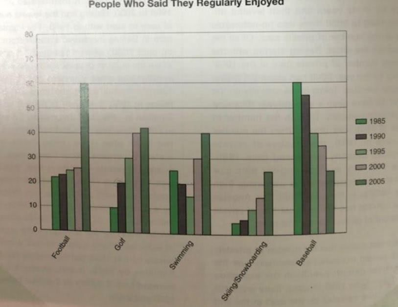
The bar chart below describes the percentage of people who enjoyed particular sports from 1985 to 2005.
Overall, a preference for all activities showed a steady decrease or increase excluding swimming on a yearly basis. A The percentage of most activities finally increased (앞으로 task1에서 증감을 엄청 다루시게 될 겁니다. 이때 increase/decrease는 모두 수많은 동의어가 있으니까 잘 활용해주세요!) in 2005, except for baseball.
A preference for football in 2005 was significantly higher than before, while it continually increased from 1985 to 2000 little by little. It peaked at the highest percentage (percentage 역시 비교적 동의어가 많은 축에 속합니다. 이것도 잘 활용해주세요!) in 2005 at 60%, which is 35% points higher than in 2000. Golf and winter sports such as skiing and snowboarding also showed a continuous rising tendency, but the average annual gap was bigger in golf compared to winter sports. Although the percentage of people that enjoyed baseball steadily declined from 1985 to 2005, the chart has shown that baseball was the most popular activity in 1985. Swimming, which shows a fluctuation of percentage different from other activities, has never been in the first place, whereas it took the last place at 25% in 2005 with baseball.
어제 피드백주신 부분 바탕으로 맨 마지막 결론 문장 삭제하고 overview만 약간 수정했어요. 첨삭 감사합니다~
총평: (7/7/6/6) 6.5
내용 분석의 경우 비교적 잘 해주셨고, 마지막 문단 관련 문제가 해결됨에 따라 구조도 괜찮아졌습니다. 표현 쪽의 경우 적어도 '틀린' 사항이 많은 건 아니지만, 보다 다양한 어휘와 문장구조가 올 여지는 있으므로 이에 대해서만 조금 봐주시면 좋을 것 같아요. 그래도 지금 글은 잘 쓰인 편이며, 채점관에 따라 7.0까지는 괜찮을 겁니다.
수고하셨습니다 :)

 비밀번호 확인
 댓글 0개
댓글 0개


 불편사항 신고