


 인쇄
인쇄


The Pie chart gives information about the country of birth of people living in Australia and the table shows where people born in these countries live.
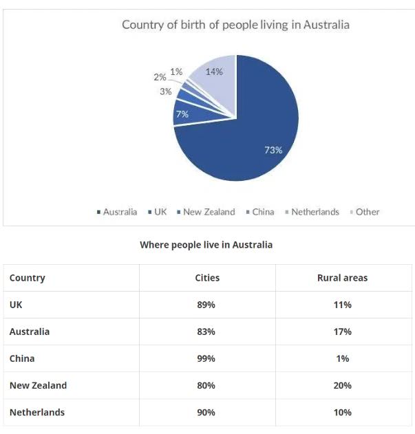
The pie chart illustrates the proportion of people living in Australia depending on their nationalities, and the table chart shows where these people live in cities of rural areas respectively.
Overall, most people who lived in Australia were Australian, and people born in particular five countries usually lived in cities of Australia.
According to the pie chart, Australian possessed the biggest part in the percentage at 73%. Although people from other countries excluding UK, New Zealand, China, and Netherlands peaked the second highest rate, the gap between Australian was almost 59%. Following by people of these other countries, British possessed the third part of this pie chart. Although there were people from New Zeland, China and Netherlands, their rate difference was significantly slight as 1%, 2%, and 3% respectively.
People of five distinctive nationalities usually lived in cities of Australia, rather than rural areas. The most interesting thing is that most Chinese lived in central areas of Australia while only 1% of them lived in the country sides. In regard of where they lived, UK and Netherlands population showed nearly the same proportion, and Australia and New Zealand population rates were similar also.
+ 선생님, 년도간의 비교가 아닐 때는 '몇 % points가 차이난다' 가 아닌 단순히 '몇 %가 차이난다' 라고 쓰면 될까요...?
감사합니다~!

 댓글 0개
댓글 0개


 불편사항 신고