


 인쇄
인쇄


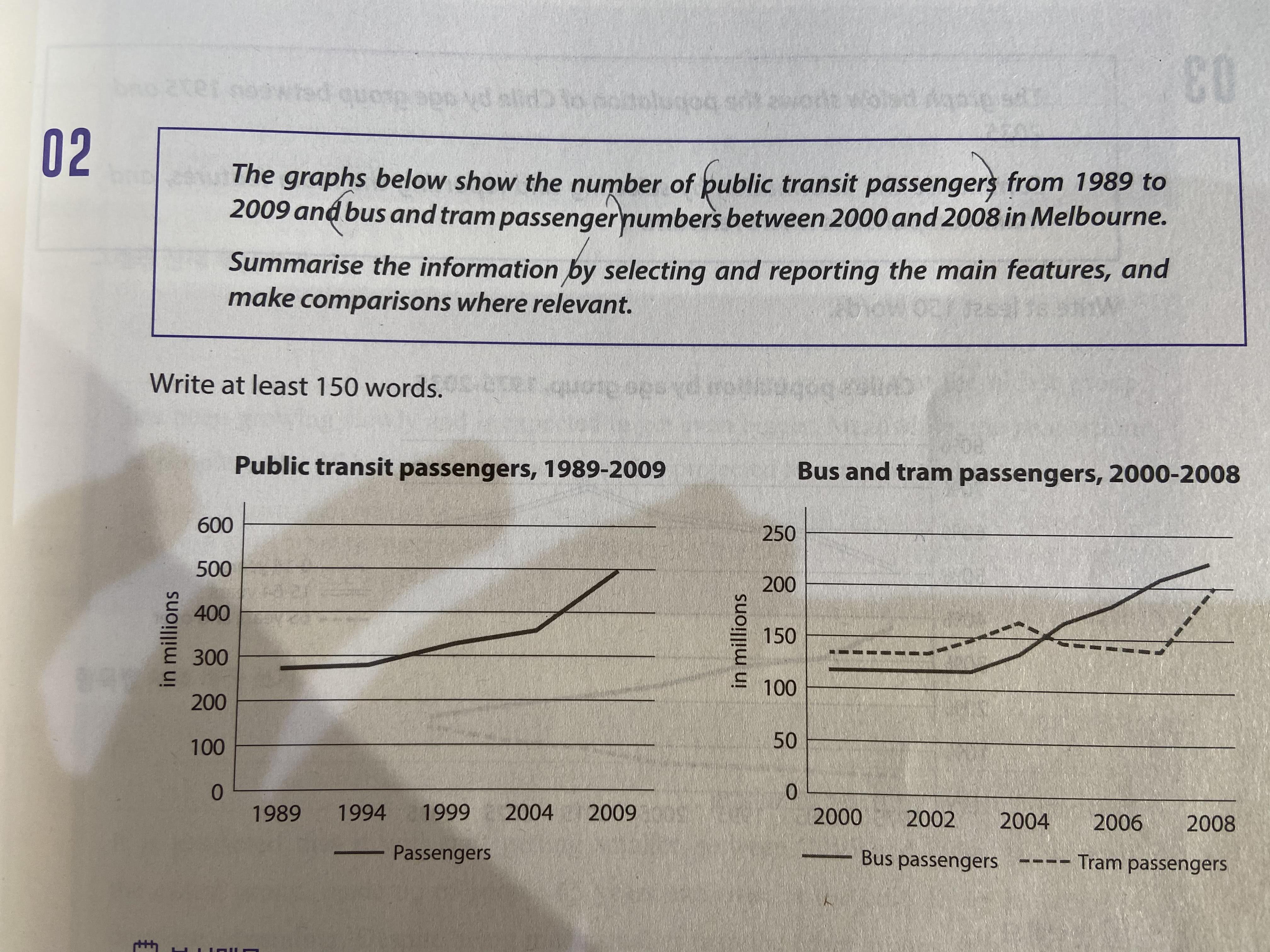
The line graphs show the number of people who
used public transit between 1989 and 2009 and the number of bus and tram
passengers from 2000 to 2008 in Melbourne.
(이 위치에 Overview를 넣어주셔야 합니다. 이게 그 어떤 것보다 중요해요! 아무리 세부적인 분석이 잘 되어있어도 Overview가 없으면 TA에서 5점, 아주 잘 쳐줘도 6점을 넘길 수 없습니다.)
According to the first graph, it is clear
that public transit passenger numbers have significantly increased. To be specific, it almost
doubled from 250 million in 1989 to 500 million by 2009. Especially, it surged
sharply from 2004 to 2009. In contrast, the figure rate between 1989 and 1994 remained
relatively stable compared to other periods.
In the second graph, it is apparent that
the number of bus and tram passengers all rose reaching over 200 million. The
similarity between two categories was that they stayed constant between 2000
and 2002. The number of bus passengers started to surge quickly in 2003 ended
up with 225 million in 2008. However, tram passenger numbers fluctuated over
6-year period after 2002. And (문장을 and but so로 시작하는 것은 좋지 않습니다.) it has shown a downward trend between 2004 and
2006. (꺾은선 그래프에서는 수치 간 역전을 다뤄주시는 게 매우 중요합니다.)
총평: (5/7/6/6) 6.0
이번 글은 평소보다 조금 아쉬웠네요. 위에서 말씀드렸듯이 Overview는 task1의 심장이므로 꼭 추가해주시고, 수치 간의 역전도 반드시 넣어주세요~
수고하셨습니다 :)

 비밀번호 확인
 댓글 1개
댓글 1개


 불편사항 신고