


 인쇄
인쇄


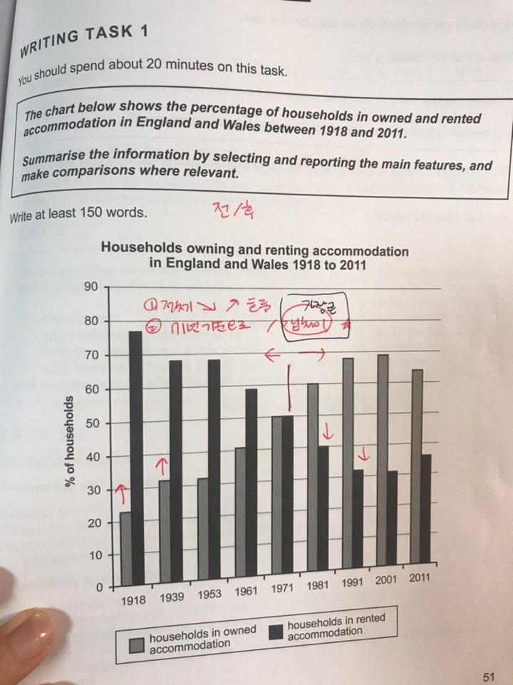
The bar graph presents how many households had owned and rented their houses in a span of 83 years from 1918 to 2011 in England and Wales.
Overall, the highest proportion of owned residence was recorded in 2001 , whereas people rented their house the most in 1918. Generally speaking, it is seen that there was an upward trend in the portion of owned residence as opposed to the percentage of rent that has decreased.
As is shown, the most notable feature is that the percentage of owned accommodation was recorded the most at around 78% in the beginning, while households in rented houses were at the lowest point at approximately 22%. Also, it is observed that between 1939 and 1953, the portion of households that owned and rented the house was the same.( about 31% and 78%, respectively). In 1971, people rented and owned exactly the same at 50%.
After 1971, the trend was changed significantly, in which the figure of owned households was higher than rented one in 1981 (60% and 40%, respectively). Moreover, in 2001, the proportion of households in owned accommodation arrived at the highest point, about 79%. In contrast, households that rented accommodation had decreased at more or less 32%. Finally, in 2001 and 2011, the gap was narrowed, ending the period at 65% and 35%, respectively.
저..약간 오버한것같아요..정신이 하나도 없었어요 ㅠㅠ
선택이 안되고 다 담아야된다는 압박을 스스로 만들어서
깔끔하게 쓰고싶은데 깔끔하지 않은것같아요!
매일 T1 분석하면서 두개씩 연습시작했는데
그림에 비해 그래프 보니 머리가 아주 복잡해지네요 ㅎㅎ
오늘도 첨삭 감사합니다^^
시간은 25분 잡았습니다 (1분씩 줄어가려구요 그래프는!)
목점:6.5

 댓글 0개
댓글 0개


 불편사항 신고