


 인쇄
인쇄


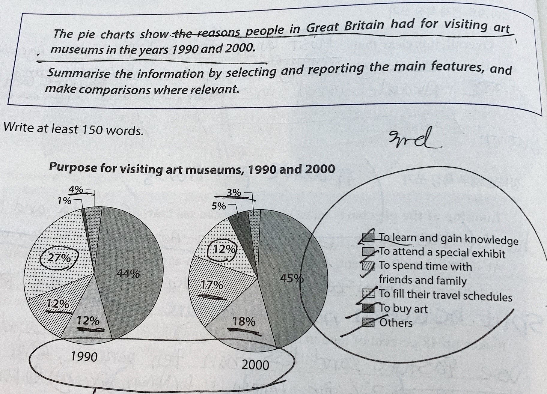
This given pie chart demonstrates that (이거 정말 많은 학생들이 틀리므로 주의해주세요~) the purposes of visiting art museums in 1990 and 2000.
Overall, It it is apparent that the purpose of learning and gaining knowledge occupied the largest proportion of both pie charts. The rest of the categories have fluctuated notably as well, exceptionally the segment of others made a meager discrepancy.
Looking at the graph more specifically, one can see that the proportion of the reason to learn and gain knowledge increased only a 1 percent point in 2000 compared to 1990. The proportion went up from 44 percent to 45 percent. However, the percentage of purpose for filling their schedule has considerably dropped by almost a half which means, it dropped from 27 percent to 12 percent. There are two categories that possessed the same rate with 12 percent in 1990. Those are the purposes to attend a special exhibit and to spend time with friends and family. Both went up by 5 percent points and 6 percent points (1만 빼고 다 s를 붙여주시면 됩니다.) respectively. Meanwhile, the segment of buying art was the smallest category in 1990 with 1 percent, it went up to 5 percent. Also, the proportion of the purpose to the others was one of the lowest in 1990 with 4 percent, but it dropped to 3 percent which became the smallest category in 2000. (지금 문장들이 죄다 the ~~of ~~로만 이루어져있기 때문에 어느정도 다양화가 필요합니다.)
215자 정도 하는것같습니당
총평: (6/7/6/6) 6.5
문법에서 적어도 이게 틀렸어! 라고 할 수 있는 부분은 거의 없었지만, 위에서 말씀드렸듯이 구조 자체가 너무 제한적입니다. 또한, 분석의 방향 역시 너무 단조로운 상황이에요. 단순히 각 항목이 어떻게 바뀌었는지 나열하는데에 그치는 것이 아니라, 동일 연도 내에서 비중의 순서가 어떻게 바뀌었는지도 어느정도는 적어보세요~(물론 큰 틀은 지금을 유지해주시면 됩니다.)
수고하셨습니다 :)

 비밀번호 확인
 댓글 0개
댓글 0개


 불편사항 신고