


 인쇄
인쇄


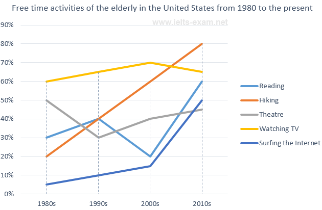
The graph below shows how elderly people in the United States spent their free time between
1980 and 2010.
Summarise the information by selecting and reporting the main features, and make comparisons where relevant.
Answer
The line graph below illustrates the activities elderly Americans spend doing in their free time from 1980 to 2010.
Overall, elderly Americans spend their free time doing different activities, among these hiking shows to be an activity gaining popularity and TV watching seems to be the most popular leisure activity among the elderly in the United States.
Firstly, between the years of 1980 through 1990, most of the activities have gained popularity among the elderly except for the activity of watching Theatre which experienced a decline from 50% to 30%. Secondly, In 1990 and 2000 a significant decrease of 20% is shown in the activity reading, while theatre has gained slight popularity of 10%, other categories showed a steady increase. Lastly, from the years 2000 to 2010 the activity of reading and surfing the internet experienced a sharp increase of 40% and almost 35% respectively. Due to the popularity of both of these activities TV watching has decreased by almost 5%. While Theatre and Hiking increased steadily.
(167 words)

 댓글 0개
댓글 0개


 불편사항 신고