


 인쇄
인쇄


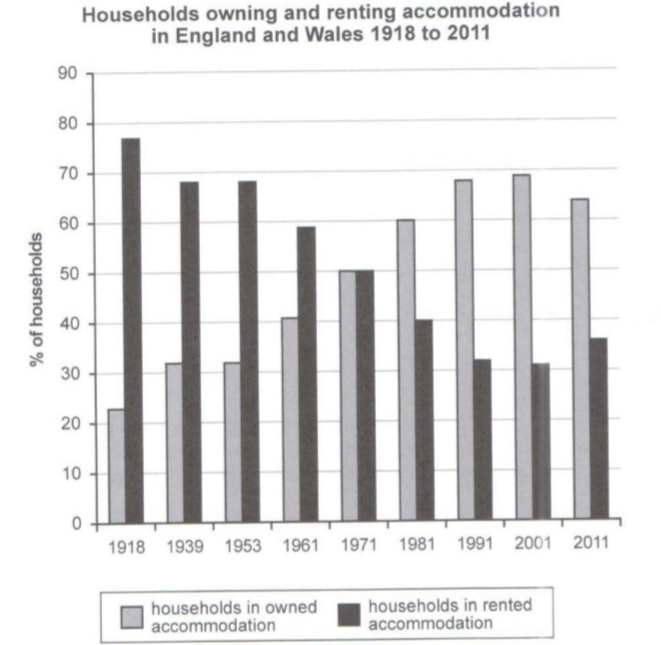
This bar chart illustrates the percentage
of households in owned and rented accommodation in England and Wales between
1918 and 2011. Overall, as a whole, the percentage of households in owned accommodation
increased and the other decreased throughout the period considerably.
At the beginning of the period, the
percentage of households in rented accommodation far exceeded the percentage of
households in owned accommodation. Over the following 53 years, the percentage
of households in owned accommodation increased and the percentage of households
in rented accommodation declined continually.
In 1971, two figures were perfectly equal
to each other. After 1971, over 30 years, two figures showed the same
consistency to the past 80 years.
In the final year, the percentage of
households in owned accommodation dropped little bit and the percentage of
households in rented accommodation showed subtle increase. However, the
percentage of households in owned accommodation remained far ahead of the
other.
첨삭 부탁드립니다! 감사합니다 :)

 댓글 0개
댓글 0개


 불편사항 신고