


 인쇄
인쇄


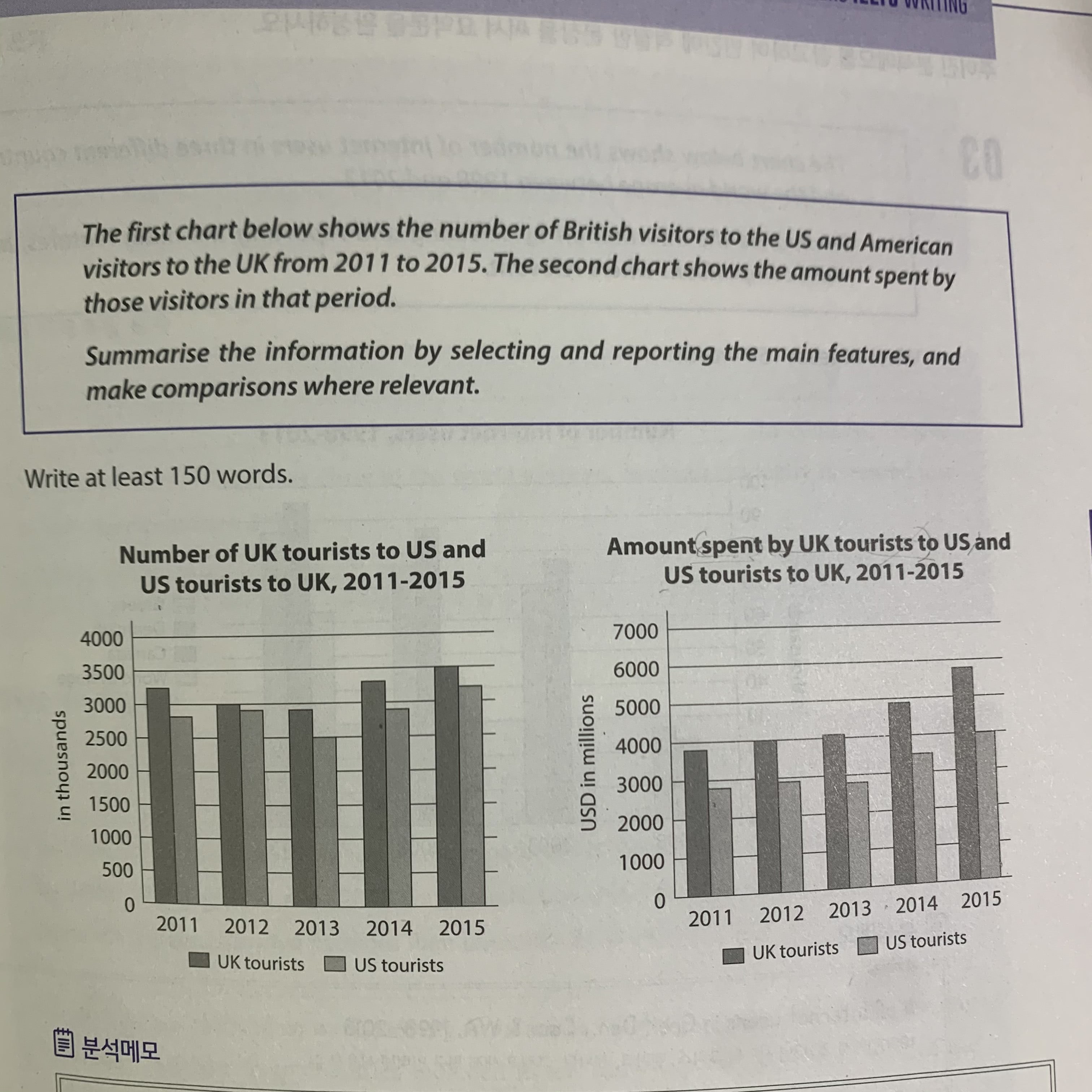
My answer:
The first bar graph shows that the tourist numbers from the UK to the US and from the US to the UK and the second one shows the amount they spent their money in their country they had visited.
In the first graph, overall, it is clear that travellers from the UK to the US were much more than travellers from the US to the UK.
in detail, the number of UK tourists to the US declined slightly from 2011 to 2013 then increased gradually to 35,000 thousand which is the highest point over the 5-years period.
Looking at the second graph, it is also clear that the amount of money of the UK tourists was bigger than the amount of money of the US tourists. More specifically, an upward trend was seen in the amount of money of UK tourists until 2015, meanwhile, there were slight shifts in the amount of money of US tourists. US travellers hit a low of under 3,000 million USD in 2013, in the next two years when it peaked at 4,000 million USD in 2015.

 댓글 0개
댓글 0개


 불편사항 신고