


 인쇄
인쇄


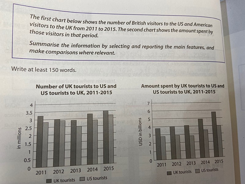
The first bar graph shows the number of UK tourists to the US and US tourists to the UK from 2011 to 2015, and the second one indicates the amount spent by them.
(이 위치에 Overview를 넣어주셔야 합니다. 표의 전반적인 내용을 포괄해주시면 돼요.)
According to the first graph, it is clear that the number of UK visitors to the US are more than US visitors to the UK during the given (given은 안 넣어도 무방하긴 합니다.) 5 years in question. The number of UK tourists to the US slightly decreased from 2011 to 2013, and then it rises from 2013 to 2015 reaching the highest point of 3.5 million 3.5milions in 2015. However In contrast, the number of US tourists to the UK peaked at over 3 million in 2015. The gap between two countries narrowed from 2011 to 2015, but soon widened in 2013.
In the second graph, it is apparent that UK tourists annually paid more than US tourists. For UK tourists, their spendings it continually increased and reached a peak of almost $6 billion in 2015. The amount spent by US tourists remained almost constant between 2011 and 2013, but begin began to ascend in 2013.
총평: (5/6/6/6) 6.0
일단 지금 글이 중앙정렬되어있고, 띄어쓰기에서도 문제가 몇 개 있었는데, 옮기는 과정에 있어서 생긴 오류라고 가정하고 점수에 따로 반영하지는 않았습니다. (실전에서 이렇게 쓸 경우 감점이 있으니까 주의해주세요~)
task1에서는 아무리 세부적인 분석을 잘 하더라도 Overview가 없으면 TA에서 5점, 잘 쳐줘도 6점을 넘기기가 어렵기 때문에, 글을 쓸 때 항상 Overview를 넣어주세요!
수고하셨습니다 :)

 비밀번호 확인
 댓글 0개
댓글 0개


 불편사항 신고