


 인쇄
인쇄


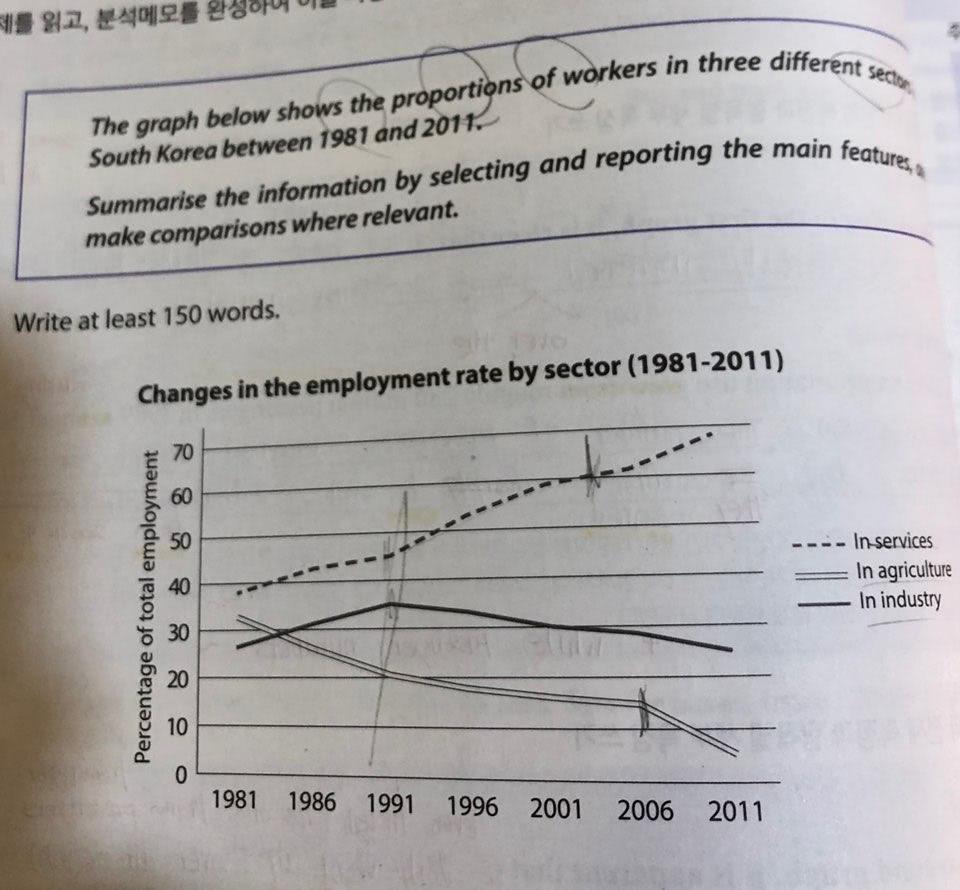
The line graph shows the number of workers in three different types of industries in South Korea from 1981 to 2001.
Overall, it is clear that the percentage of services increased continually between 1981 and 2011, while the percentage of industry rosed until 1991, after that period, it steadily dropped. In the case of agriculture, it has experienced a steady drop in rate been experienced steadily dropped over the period.
Looking at the graph more closely, one can see that the number of workers in services has been increased since 1981 (이렇게 쓰면 표에서 알 수가 없는 내용이라 틀리게 되는데, 이에 대해서는 총평에서 링크를 넣어드리겠습니다.). In contrast, the percentage of agriculture dropped continually until 2011. it It almost decreased by 24 percent (여기의 경우도 링크를 하나 드리겠습니다.)from about 32 percent in 1981 to 8percent by 2011. In industry, the employment figures rosed about 8 percent (이 역시 앞선 부분과 같은 맥락에서 갑니다.) between first 10 years, but since then, the rates steadily dropped until 2011, hitting a low of 23 percent.
총평: (6/6/6/6) 6.0
꺾은선 그래프에서 수치 간 역전을 다루는 것은 매우 중요합니다. 이 표의 경우 81년과 86년 사이에 수치 간 역전이 있으므로 이를 다뤄주시면 좋아요.
나머지 두 부분은 밑의 링크를 꼭 참고해주세요!
수고하셨습니다 :)
https://www.gohackers.com/?c=ielts/ielts_info2/ielts_writing&type=url&uid=461474 (2-2번)
https://www.gohackers.com/?c=ielts/ielts_info2/ielts_method&type=url&uid=486596

 비밀번호 확인
 댓글 0개
댓글 0개


 불편사항 신고