


 인쇄
인쇄


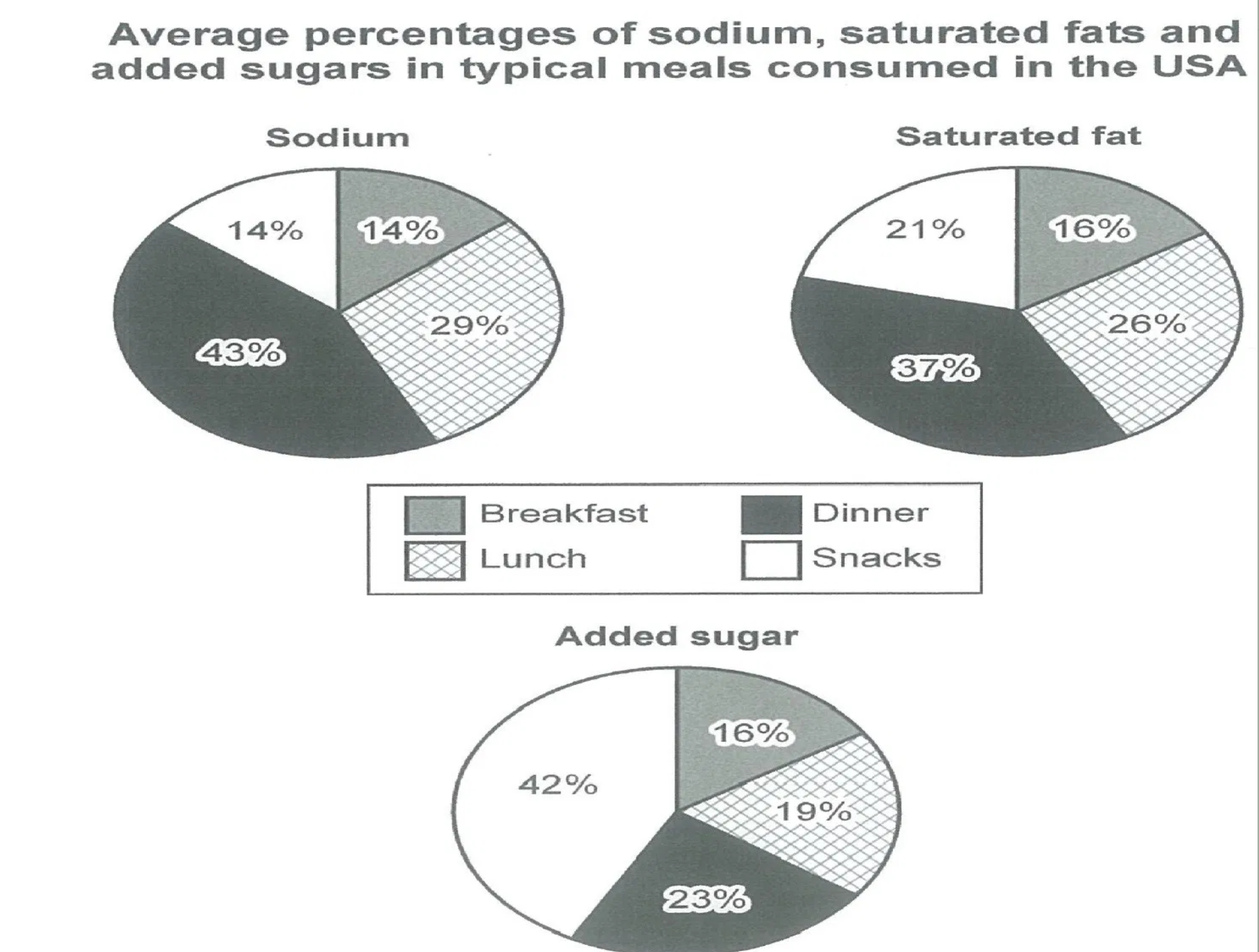
The charts illustrate the average amounts of intake of unhealthy nutrients, divided into three sorts(Sodium, Saturated fat, Added sugar) as people have ordinary meals a day in the United States of America.
Overall, sodium and Saturated fat have similar patterns whereas added sugar has a different one solely.
It is clear that sodium and saturated fat are the most consumed nutrients in dinner, which accounted for more than a third of total at 43% 37% each. By contrast, the consumption of added sugar accounts for the highest proportion in snacks. Breakfast contains less whole nutrients compared to other meals, all in all.
Looking at the first chart more closely, one can see that breakfast and snacks comprise equal proportions of sodium at 14%. Saturated fat, the second chart indicates the three portions of meals, except for dinner, contains similar levels, shown a 10 or under 10% points gap. Similarly, the average percentages of added sugar is consumed nearly equally in each part excluding snacks, appearing below a 10% points gap.
다른 분들 첨삭해주신 것을 보다가 percent points에 관한 글을 발견했습니다! '세 파트가 10%이하의 차이를 보여준다' 를 표현하고 싶을 때 퍼센트 포인트로 표시하는게 맞나요?
감사합니다 :)

 댓글 0개
댓글 0개


 불편사항 신고