


 인쇄
인쇄


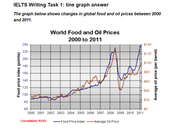
The line graph depicts the information about global food and oil prices from the year 2000 to 2011. In overall, the records of food and oil costs showed similar trends.
Turning to the details, as for food prices, the number started at about about 90 points in 2000 and hold straight comparatively to 2004, compared with the others years. In 2004, the figure of eating costs increased, accounting for near 100 points and keep upward patterns to the middle of the year 2005. The level decreased marginally to approximately in 2007 and surged just under 220 points in 2008 which was the highest level. However, the costs plummeted as around 140 points and fluctuated in the early of the year 2011 and went up, making up 140 points.
When it comes to oil prices, the level illustrated a steady increased from just over $20 to near $120 during the about 8 years which indicated from the year 2000 to 2008. In 2005 and 2007, the oil graph overtook the food ones. The costs declined significantly to about $80 in 2009 which overtook the food graph again and climbed to around $140 which was the peak.

 댓글 0개
댓글 0개


 불편사항 신고