


 인쇄
인쇄


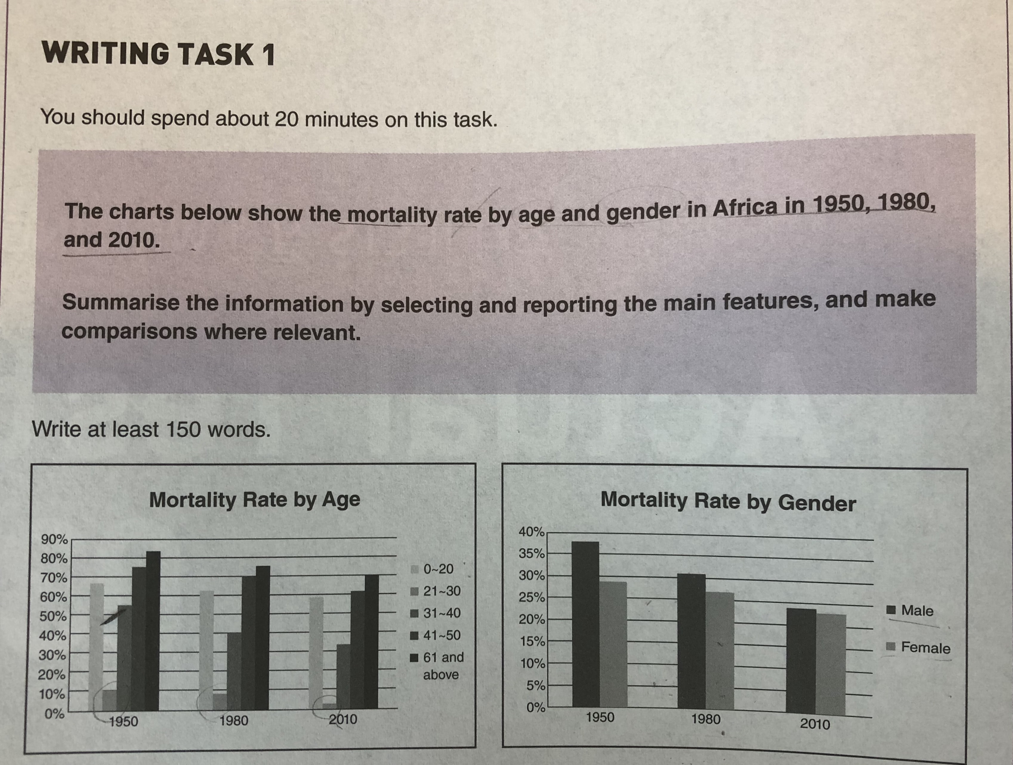
This These two bar graphs show the information concerning the mortality rate in Africa by age and gender in 1950, 1980 and 2010.
Firstly, in the chart by age, the oldest members of society had the highest mortality rate during the period. They Their rate had declined from 83% to 70% between 1950 and 2010. In contrast, the young adults in their 20s had the lowest mortality rate. The figure decreased from 10% to 2% throughout the period. It is noteworthy that the youngest members of society had relatively high a mortality rate compared to the young adults. The figure was over 55% for the whole period. (작성하면서 의식하셨을지 모르겠는데, 지금 문단의 6문장을 2개씩 끊어서 보면 구조가 완벽히 일치합니다. 이러한 단조로움으로는 문법에서 어느정도의 감점은 감안하셔야 하므로, 안정적인 6.5점 이상이 필요하면 꼭 구조 자체를 다양화해주세요~)
In the bar graph by gender, the mortality rate of male had higher figures than that of females throughout the period. In 1950, they were 38% and 29%, respectively. However, the two mortality rates of male and female became similar figures in 2010. The figures were around 23%. (여기의 경우도 마찬가지입니다.)
Overall, the probability of death became was being lower as time passed, regardless of age and gender. (task 1 overview는 유형 관계없이 서론 밑으로 넣으시면 됩니다.)
고칠부분이 많아서...첨삭 부탁드릴게요!!
총평: (6/6/6/6) 6.0
문법에서 틀린 게 그렇게 많지 않다는 점은 긍정적이나, 위에서 말씀드렸듯이 두 문단을 통째로 두 문장구조에만 의존하는 상황이라 단조로움이 발목을 잡고 있습니다. 채점관에 따라 문법에서는 5점까지 내려갈 위험도 있기 때문에, 반드시 구조를 어느정도는 다양화해주세요~
수고하셨습니다 :)

 비밀번호 확인
 댓글 0개
댓글 0개


 불편사항 신고