


 인쇄
인쇄


You should spend about 20 minutes on this task.
The graph below shows the number of enquiries received by the Tourist Information Office in one city over a six-month period in 2011.
Summarize the information by selecting and reporting the main features and make comparisons where relevant.
You should write at least 150 words.
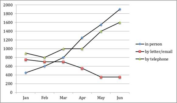
The given line graphs compare the number of enquiries received in three different ways by the Tourist Information Office in certain city over a six-month period in 2001.
Overall, It is noticeable that inquiries by person and by letter/email was gradually increased until end of the given month, but, only inquiry by telephone was decreased.
In detail, the number of enquiries received by letter/email started at approximately 900 in January. This figure rose to from 1000 in March to 1400 in June. Also the number of enquiries by in person started at around 400 in January and then reached peak at around 1900 in June.
By contrast, the number of enquiries received by telephone started at approximately 800 in January. This figure steadily down at 800 in March before dramatically dropped by almost 400 in June.
걸린시간:20분,목표점수:6.5

 댓글 0개
댓글 0개


 불편사항 신고