


 인쇄
인쇄


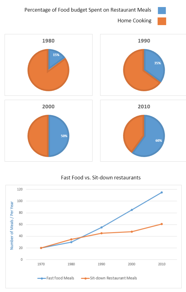
The pie charts provide information related to the proportion of food budget that the average family spent on restaurant foods and cooking at home in Australia in four particular years (from 1980 to 2010) while line graph illustrates the number of meal consumption during the years 1970 to 2010, with a focus on two different ways of having meals.
In general, (잘 넣어주셨습니다. task1의 두 번째 문단에서는 이 표현을 그냥 기계적으로 넣어주세요!) it can clearly be seen that the percentage of those families that spent their budget on outside food outnumbered throughout the whole period (제가 이전에 이걸 미처 말씀드리지 못했는데, 이 친구 역시 문제가 있습니다. 기간 내내 바깥쪽 음식의 비율이 높은 건 아니므로, 이렇게 적을 수 없어요.) and a great number of people who took fast food meals considerably rose during the years.
As for the pie chart, the 85% of Australians cooked at home and only 15% of them was spent on food budget in restaurants in 1980 (여기는 갑자기 왜 엉뚱하게 바꾸셨는지 모르겠는데, 이렇게 쓰면 틀리게 됩니다. 85%의 호주인들이 집에서 요리한 게 아니라, 평균 호주 가정의 식비 중 85%가 집에서 요리하는데 쓰였다는 의미로 적어주셔야 해요. 이전 글처럼 적으시면 됩니다.). Over the period, in 2010, the percentage of expenditure on restaurant meals accounted for 60% while the remaining 40% was used for home cooking.
Regarding the line graph, Australian people ate the same number of meals for junk food and sit-down restaurant foods in 1970 (20). However, this figure gradually increased by 2010, then the fast food was largely consumed in 2010 (just under 120 meals) while just over 60 sit-down restaurant meals were consumed.
저번에 overview 파트를 다시 작성해 보는 걸 추천하셨습니다 조언 주신 걸 바탕으로 재작성해 보았어요
조언 주신 것들 정말 주옥같이 받아들이고 있습니다.
제가 잘 소화하도록 노력할게요!
총평: 네 치치님, 항상 파이팅입니다! 이번에 제가 표시해드린 두 부분 모두 중요합니다. 이미 두 번 쓰셨으므로 글 자체를 재작성할 필요까지는 없고, 그냥 저 두 부분만 수정해보시고 댓글로 검사 받으세요!
수고하셨습니다 :)

 비밀번호 확인
 댓글 1개
댓글 1개


 불편사항 신고