


 인쇄
인쇄


The graph below shows how people buy music. Summarise the information by selecting and reporting the main features, and make comparisons where relevant.
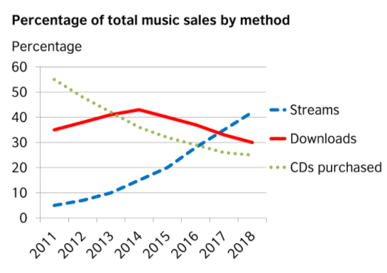
The given line graph illustrates the trend in music sales with three methods between 2011 and 2018.
Overall, it is clear that both the category
of downloads and CDs purchased drew the descent while, there was a perfectly opposite
line which showed in the one of streams.
In detail, in 2011, at around 55% was CDs which
was the majority of music sales. In contrast, people who sold music by
streaming accounted for merely 5% in the same year. The gap between the two methods
for selling music was getting smaller and smaller over the 4 years period as
each increase or decrease slightly. However, by 2016, the latter began to climb
steeper to 30% and met with the percentage of CDs. purchasing It continuously rose
to reverse the former since 2017 and then reached a high of slight over 40%.
Meanwhile, there was at about 35% music down loaders by 2011. Although It ascended slightly to approximately 42% until 2014, it started to plunge by 10% in 2018.
목표점수:7.0
글자 수:169자
소요시간:측정안함
외부도움:없음
시험예정일:미정

 댓글 0개
댓글 0개


 불편사항 신고