


 인쇄
인쇄


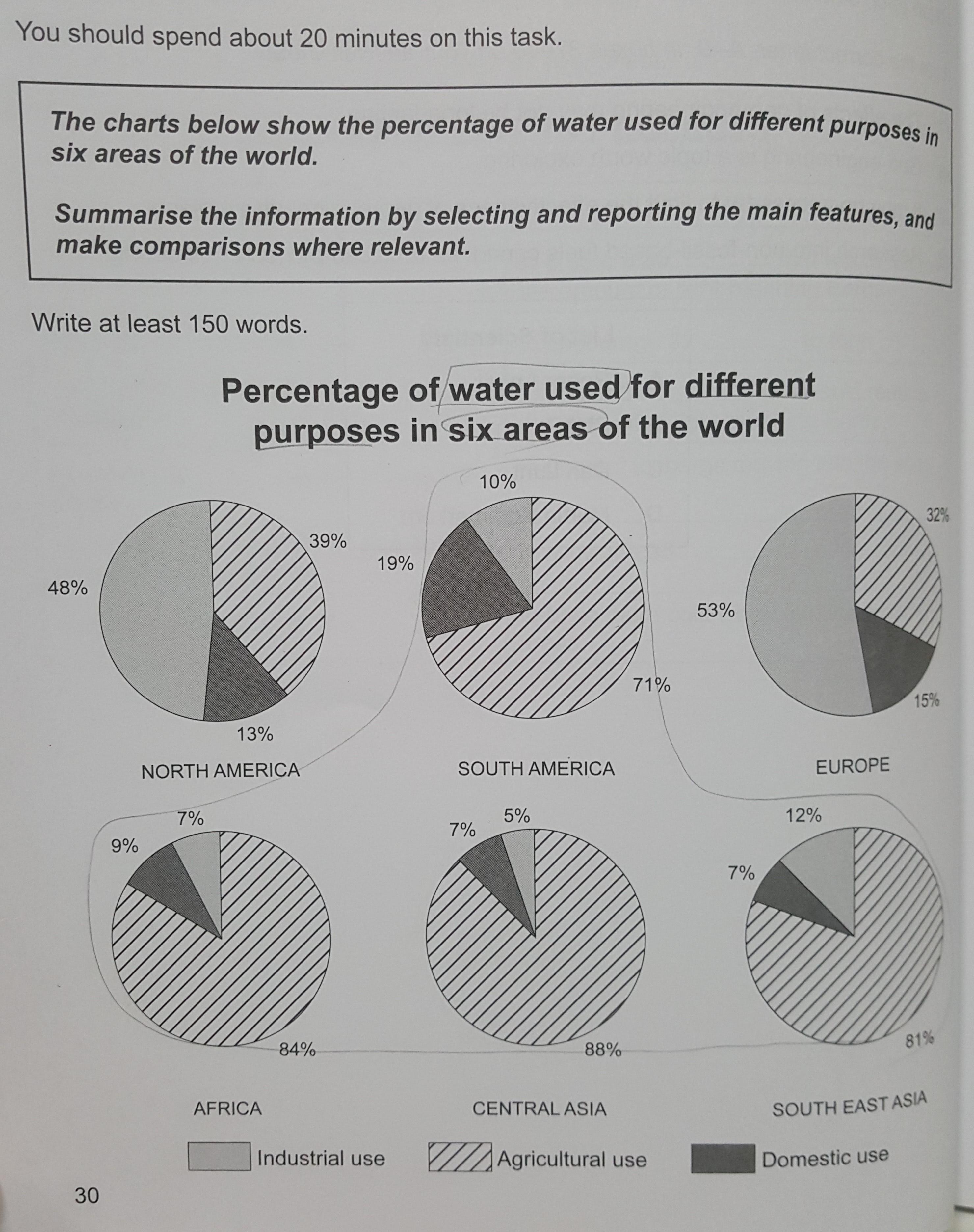
The pie charts illustrate the percentage of water used for various purposes in six area.
Overall, each area included in the diagram has different ratio of water used by purposes. However, the percentages of agricultural use take the largest or the second largest in all six areas.
Looking at the graph more closely, one can see that all six regions except for Europe and North America, have massive portions of agricultural use ranged from 71% to 88%. Therefore, the figures in these four areas are higher than the other sectors combined. Meanwhile, the percentages of water used for industrial purpose are the largest in North America and Europe, with 48% and 53%, respectively. In addition, four areas apart from South America and Central Asia used water for domestic use the least, while the portions of domestic use in South America and Central Asia are the second largest at 19%, 7% each.

 댓글 0개
댓글 0개


 불편사항 신고