


 인쇄
인쇄


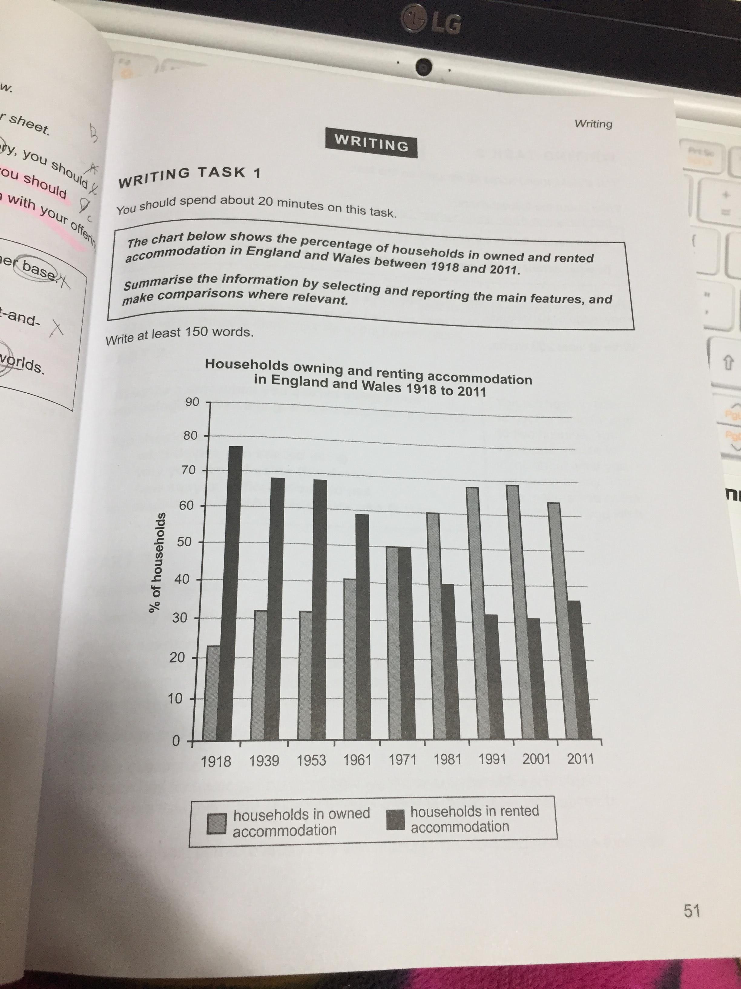
The bar chart depicts the proportions about the information how many those who have owned or rented house live in England and Wales from the year 1918 and 2011. In overall, The proportions about rented house illustrated downward trend, while the upward trend represented to the graph related to owned accommodation.
In regarding to households in rented accommodation, the figures in 1918 occupied about 77% which was the highest during the given period. The proportions levelled off in 1939 and 1953, making up approximately 68%. After the year, the bar graph showed declined percentages. This trend continued and the lowest figure recorded just over 30% in 2001. Meanwhile, the figure increased slightly by around 5% points from 31% in 2001 to 36% in 2011.
About owned houses, the proportion took up 22% in 1918 and grow up, constituting 31% in 1939. The level in 1939 was same, compared with the percentage in 1953. Those who living in the owned houses rose continuously and the figure overtook the figure about rented houses by 20% points in 1981. The upward trend did not show in 2011.
시간에 맞춰 작성은 했으나 이후에 수정해야할 부분이 조금 있었습니다
원래 시험은 3월 예정이었는데 몇달 미뤄야 할 것 같습니다

 댓글 0개
댓글 0개


 불편사항 신고